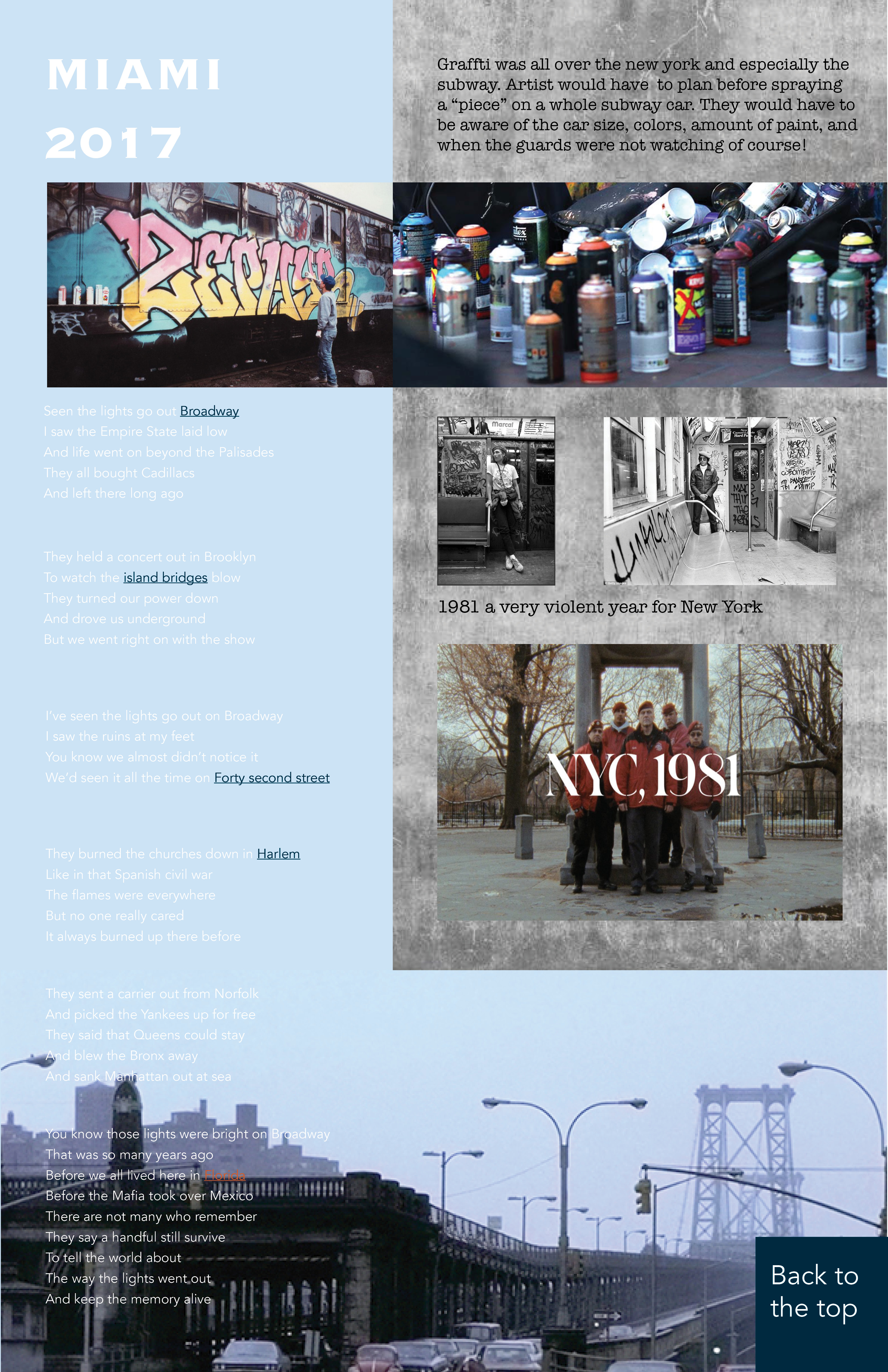
Suggestions that were made by my classmates wewre very helpful. They primarily revolved around stronger hierarchy and theme. My song is about the destruction of New York told by someone that is now retired in Florida in 2017. Christina made a suggestion to make the layout more like an old newspaper form New York 1980s. This new concep will drastically change the layout, but it will solve the problem with the text. The blue background and the white text blend together where it becomes harder to read. Mimicing a newspaper will solve that problem. In the test I really want to incorporate boxs and links that will appear when the user scrolls over text so that they can learn what certain words mean becasue not everyone is from New York. Christina recommended that I use Genius which is a website similar to my idea. Unfortunately this project will not get done this weekend. But it is an amazing and engaging idea that will be done!!!!!!